How to choose a lock screen wallpaper that keeps your clock readable
A few simple rules about subject placement, contrast and calm space that make any photograph work on a phone lock screen.
A photograph that looks stunning in a gallery can become a mess on a lock screen, where the clock, the date, notifications and widgets all sit on top of it. With a few simple rules, you can choose images that look intentional and stay easy to read.
Leave the top third calm
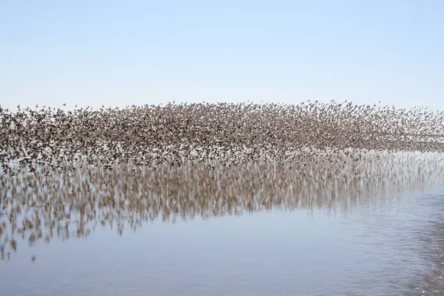
Most phones place the clock in the upper part of the lock screen. Choose images where that area is relatively plain: open sky, mist, still water or a soft out-of-focus background. Avoid branches, text, busy patterns or the main subject's face sitting directly behind the time.
Put the subject low and central
Subjects in the lower-middle part of the frame work best. They are visible below the clock and above the shortcut buttons at the bottom. An animal standing in a meadow, a lighthouse on a coast or a lone tree on a hill all fit this naturally. Every wallpaper on this site has a focal point we set by hand, and our phone sizes are cropped around it, so the subject stays in view.
Check the contrast
The clock is usually white or a light colour. Dark and mid-tone images keep it readable. Very bright images, such as snowfields or white sand, can make white text hard to read. Your phone may add a shadow or tint automatically, but a darker image usually looks cleaner. If you love a bright image, try it on the home screen instead, where icons have their own backgrounds.
Use the depth effect
On recent iPhones, the lock screen can place a clearly separated subject slightly in front of the clock, so a bird's head or a mountain peak overlaps the numbers. It works best with a strong, well-defined subject against a simple background, and only when the subject doesn't cover too much of the time. Portrait-orientation photographs with plenty of sky are ideal.
Let your phone take its colours from the picture
Many Android phones can generate their system colours (buttons, toggles, keyboard) from your wallpaper. A wallpaper with one clear, pleasant accent colour, such as autumn orange, sea blue or forest green, gives a coordinated look across the whole phone.
Pick the right size
Phone screens are tall and narrow, about 9:19.5 on most modern models. Download the phone size rather than the desktop original, so your phone doesn't have to guess how to crop it. Phones also zoom wallpapers slightly to create a parallax effect when you tilt them. Leave a small margin around anything important, or turn off “perspective zoom” or the equivalent in your settings.
A quick checklist
- Is the area behind the clock simple?
- Is the subject in the lower-middle of the frame?
- Is the image dark enough for white text?
- Did you download the phone size, not the desktop one?
You can browse our phone-ready selection on the phone wallpapers page.